 NiceSnippets.com
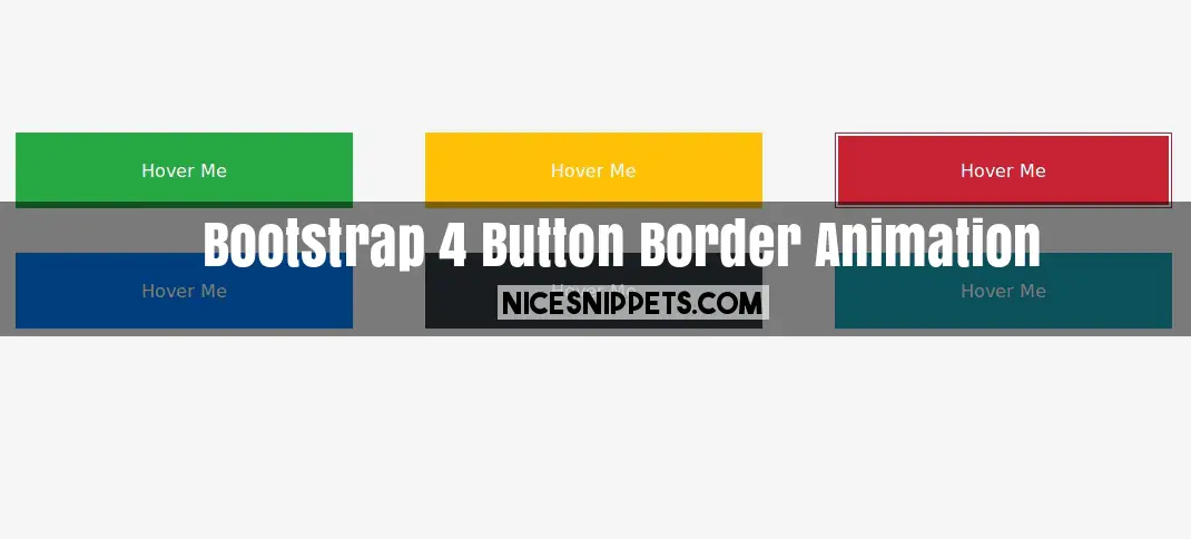
Many Types Of Bootstrap 4 Button Border Animation
In this post we are giving you best border effect with bootstrap 4 different button. this is bootstrap 4 button hover effect. it's a border animation on hover css3. border animation on hover. button hover effects bootstrap.
We allows to free snippets of bootstrap button hover effects , you can download full code of bootstrap button hover animation layout. Here in this post i will give you example of bootstrap button hover border snippet and you will get simple code of html, css and jquery. In css button hover animation snippet i give you three tab with html, css and js, you can easily get code of button hover effects bootstrap layout.
<!DOCTYPE html>
<html>
<head>
<title>Hover Border Effect In Button Using Bootstap 4.0</title>
<link rel="stylesheet" href="https://maxcdn.bootstrapcdn.com/bootstrap/4.0.0-beta.2/css/bootstrap.min.css">
<link rel="stylesheet" type="text/css" href="custom.css">
</head>
<body>
<div class="container main-section">
<div class="row">
<div class="col-lg-12 m-0 p-0">
<button class="btn-1 btn btn-success rounded-0"><span>Hover Me</span></button>
<button class="btn-2 btn btn-warning text-white rounded-0"><span>Hover Me</span></button>
<button class="btn-3 btn btn-danger rounded-0"><span>Hover Me</span></button>
<button class="btn-4 btn btn-primary rounded-0"><span>Hover Me</span></button>
<button class="btn-5 btn btn-dark rounded-0"><span>Hover Me</span></button>
<button class="btn-6 btn btn-info rounded-0"><span>Hover Me</span></button>
</div>
</div>
</div>
</body>
</html>
body{
font-family: 'PT Sans', sans-serif;
background: #f5f5f5;
}
.main-section{
margin-top:120px !important;
}
button{
display: inline-block;
position: relative;
background: none;
border: none;
color: #fff;
font-size: 18px;
cursor: pointer;
margin: 20px 30px;
background: rgba(0,0,0,0.09);
}
span{
display: block;
padding: 15px 100px;
}
button::before, button::after{
content:"";
width: 0;
height: 2px;
position: absolute;
transition: all 0.2s linear;
background: #fff;
}
span::before, span::after{
content:"";
width:2px;
height:0;
position: absolute;
transition: all 0.2s linear;
background: #fff;
}
button:hover::before, button:hover::after{
width: 100%;
}
button:hover span::before, button:hover span::after{
height: 100%;
}
/*----- button 1 -----*/
.btn-1::before, .btn-1::after{
transition-delay: 0.2s;
}
.btn-1 span::before, .btn-1 span::after{
transition-delay: 0s;
}
.btn-1::before{
right: 0;
top: 0;
}
.btn-1::after{
left: 0;
bottom: 0;
}
.btn-1 span::before{
left: 0;
top: 0;
}
.btn-1 span::after{
right: 0;
bottom: 0;
}
.btn-1:hover::before, .btn-1:hover::after{
transition-delay: 0s;
}
.btn-1:hover span::before, .btn-1:hover span::after{
transition-delay: 0.2s;
}
/*--- Button 2 -------*/
.btn-2::before, .btn-2::after{
transition-delay: 0s;
}
.btn-2 span::before, .btn-2 span::after{
transition-delay: 0.2s;
}
.btn-2::before{
right: 0;
top: 0;
}
.btn-2::after{
left: 0;
bottom: 0;
}
.btn-2 span::before{
left: 0;
top: 0;
}
.btn-2 span::after{
right: 0;
bottom: 0;
}
.btn-2:hover::before, .btn-2:hover::after{
transition-delay: 0.2s;
}
.btn-2:hover span::before, .btn-2:hover span::after{
transition-delay: 0s;
}
/*----- button 3 -----*/
.btn-3::after{
left: 0;
bottom: 0;
transition-delay: 0.6s;
}
.btn-3 span::after{
transition-delay: 0.4s;
right: 0;
bottom: 0
}
.btn-3::before{
right: 0;
top: 0;
transition-delay: 0.2s;
}
.btn-3 span::before{
transition-delay: 0s;
left: 0;
top: 0;
}
.btn-3:hover::after{
transition-delay: 0s;
}
.btn-3:hover span::after{
transition-delay: 0.2s;
}
.btn-3:hover::before{
transition-delay: 0.4s;
}
.btn-3:hover span::before{
transition-delay: 0.6s;
}
/*----- button 4 -----*/
.btn-4::after{
right:0;
bottom: 0;
transition-duration: 0.4s;
}
.btn-4 span::after{
right:0;
bottom: 0;
transition-duration: 0.4s;
}
.btn-4::before{
left: 0;
top: 0;
transition-duration: 0.4s;
}
.btn-4 span::before{
left: 0;
top: 0;
transition-duration: 0.4s;
}
/*----- button 5 -----*/
.btn-5::after{
left:0;
bottom: 0;
transition-duration: 0.4s;
}
.btn-5 span::after{
right:0;
top: 0;
transition-duration: 0.4s;
}
.btn-5::before{
right: 0;
top: 0;
transition-duration: 0.4s;
}
.btn-5 span::before{
left: 0;
bottom: 0;
transition-duration: 0.4s;
}
/*----- button 6 -----*/
.btn-6::before{
left: 50%;
top: 0;
transition-duration: 0.4s;
}
.btn-6::after{
left: 50%;
bottom: 0;
transition-duration: 0.4s;
}
.btn-6 span::before{
left: 0;
top: 50%;
transition-duration: 0.4s;
}
.btn-6 span::after{
right: 0;
top: 50%;
transition-duration: 0.4s;
}
.btn-6:hover::before, .btn-6:hover::after{
left: 0;
}
.btn-6:hover span::before, .btn-6:hover span::after{
top: 0;
}