10-Apr-2023
.
Admin
Hi Guys,
In this blog, I will show you how to use tailwind css modal in laravel. We will talk about laravel tailwind css modal example. In this article i will give simple button click then open modal and close button in modal for close modal.
Tailwind CSS is the only framework that I've seen scale on large teams. It’s easy to customize, adapts to any design, and the build size is tiny.
Tailwind is so low-level, it never encourages you to design the same site twice. Even with the same color palette and sizing scale, it's easy to build the same component with a completely different look in the next project.
Here I will give you full example for laravel tailwind css example so let;s see the bellow step by step:
Step 1: Install Laravel Project
First, you need to download the laravel fresh setup. Use this command then download laravel project setup :
composer create-project --prefer-dist laravel/laravel blog
Step 2: Install Tailwind CSS Via NPM
In this step, you need install tailwind css and tailwind css requires Node.js 12.13.0 or higher using bellow command so let's install the tailwind css.
npm install
Install Tailwind and its peer-dependencies using npm:
npm install -D tailwindcss@latest postcss@latest autoprefixer@latest
Create your configuration file
you can generate your tailwind.config.js file using bellow command:
npx tailwindcss init
This will create a minimal tailwind.config.js file at the root of your project or open this file and paste bellow code:
tailwind.config.js
module.exports = {
    purge: [
        './resources/**/*.blade.php',
        './resources/**/*.js',
        './resources/**/*.vue',
    ],
    darkMode: false, // or 'media' or 'class'
    theme: {
        extend: {},
    },
    variants: {
        extend: {},
    },
    plugins: [],
}
Step 3 : Configure Tailwind with Laravel Mix
In this step, you can configure tailwind with laravel mix and change in your webpack.mix.js, add tailwindcss as a PostCSS plugin:
mix.js("resources/js/app.js", "public/js")
    .postCss("resources/css/app.css", "public/css", [
     require("tailwindcss"),
]);
Step 4 : Include Tailwind in your CSS
Open the ./resources/css/app.css file that Laravel generates for you by default and use the @tailwind directive to include Tailwind's base, components, and utilities styles, replacing the original file contents:
resources/css/app.css
@tailwind base;
@tailwind components;
@tailwind utilities;
Step 5 : Add Route
use App\Http\Controllers\HomeController;

Route::get('/', [HomeController::class,'index']);
Step 6 : Create Controller
In this step, you can create new controller as HomeController so let's open terminal and bellow artisan command to create controller.
php artisan make:controller HomeController
app/Http/Controllers/HomeController.php
<?php

namespace App\Http\Controllers;

use Illuminate\Http\Request;
use Illuminate\Support\Facades\Route;

class HomeController extends Controller
{
    public function homePage()
    {
        return view('tailwind-modal');
    }
}
Step 7 : Create Blade File
In last step, You can create modal view as tailwind-modal.blade.php So let's create tailwind-modal.blade.php file and paste bellow code:
resources/views/tailwind-modal.blade.php
<!DOCTYPE html>
<html>
<head>
<title>Laravel Tailwind CSS Modal Example - NiceSnippets.com</title>
<meta charset="UTF-8" />
<script type="text/javascript" src="{{ asset('js/app.js') }}"></script>
<meta name="viewport" content="width=device-width, initial-scale=1.0" />
<link href="{{ asset('css/app.css') }}" rel="stylesheet">
<script src="https://ajax.googleapis.com/ajax/libs/jquery/3.5.1/jquery.min.js"></script>
</head>
<body>
<button type="button" class="focus:outline-none openModal text-white text-sm py-2.5 px-5 mt-5 mx-5 rounded-md bg-green-500 hover:bg-green-600 hover:shadow-lg">Open Modal</button>
<!-- This example requires Tailwind CSS v2.0+ -->
<div class="fixed z-10 inset-0 invisible overflow-y-auto" aria-labelledby="modal-title" role="dialog" aria-modal="true" id="interestModal">
<div class="flex items-end justify-center min-h-screen pt-4 px-4 pb-20 text-center sm:block sm:p-0">
<div class="fixed inset-0 bg-gray-500 bg-opacity-75 transition-opacity" aria-hidden="true"></div>
<span class="hidden sm:inline-block sm:align-middle sm:h-screen" aria-hidden="true"></span>
<div class="inline-block align-bottom bg-white rounded-lg text-left overflow-hidden shadow-xl transform transition-all sm:my-8 sm:align-middle sm:max-w-lg sm:w-full">
<div class="bg-white px-4 pt-5 pb-4 sm:p-6 sm:pb-4">
<div class="sm:flex sm:items-start">
<div class="mx-auto flex-shrink-0 flex items-center justify-center h-12 w-12 rounded-full bg-red-100 sm:mx-0 sm:h-10 sm:w-10">
<svg @click="toggleModal" class="h-6 w-6 text-red-600" xmlns="http://www.w3.org/2000/svg" fill="none" viewBox="0 0 24 24" stroke="currentColor" aria-hidden="true">
<path stroke-linecap="round" stroke-linejoin="round" stroke-width="2" d="M12 9v2m0 4h.01m-6.938 4h13.856c1.54 0 2.502-1.667 1.732-3L13.732 4c-.77-1.333-2.694-1.333-3.464 0L3.34 16c-.77 1.333.192 3 1.732 3z" />
</svg>
</div>
<div class="mt-3 text-center sm:mt-0 sm:ml-4 sm:text-left">
<h3 class="text-lg leading-6 font-medium text-gray-900" id="modal-title">
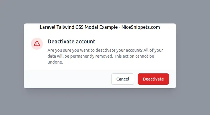
Deactivate account
</h3>
<div class="mt-2">
<p class="text-sm text-gray-500">
Are you sure you want to deactivate your account? All of your data will be permanently removed. This action cannot be undone.
</p>
</div>
</div>
</div>
</div>
<div class="bg-gray-50 px-4 py-3 sm:px-6 sm:flex sm:flex-row-reverse">
<button type="button" class="w-full inline-flex justify-center rounded-md border border-transparent shadow-sm px-4 py-2 bg-red-600 text-base font-medium text-white hover:bg-red-700 focus:outline-none focus:ring-2 focus:ring-offset-2 focus:ring-red-500 sm:ml-3 sm:w-auto sm:text-sm">
Deactivate
</button>
<button type="button" class="closeModal mt-3 w-full inline-flex justify-center rounded-md border border-gray-300 shadow-sm px-4 py-2 bg-white text-base font-medium text-gray-700 hover:bg-gray-50 focus:outline-none focus:ring-2 focus:ring-offset-2 focus:ring-indigo-500 sm:mt-0 sm:ml-3 sm:w-auto sm:text-sm">
Cancel
</button>
</div>
</div>
</div>
</div>
<script type="text/javascript">
$(document).ready(function () {
$('.openModal').on('click', function(e){
$('#interestModal').removeClass('invisible');
});
$('.closeModal').on('click', function(e){
$('#interestModal').addClass('invisible');
});
});
</script>
</body>
</html>
It will help you....
#Laravel 8
#Laravel 7
#Laravel
#Laravel 6
