custom radio button and checkbox design free code. radio button and checkbox onclick best hover effect. nicesnippets provide free code for custom design of radio button and checkbox
you can get code of animated radio button css snippet. we give you example of cool radio buttons css , you can simple copy bellow code and use in your project. If it free snippets of fancy checkboxes and radio buttons with css So you have to simple get those bellow code from tab of html, css and js. you simple click on HTML Code then you will get html code how to change radio button style ? snippets, click on JS Code tab get code of jquery codd for radio button style bootstrap snippets, same as for CSS Code tab. It's pretty easy and simple example of styling radio buttons css tricks snippet.
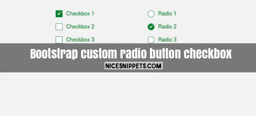
<!DOCTYPE html>
<html>
<head>
<link rel="stylesheet" type="text/css" href="https://maxcdn.bootstrapcdn.com/bootstrap/3.3.7/css/bootstrap.min.css">
<link rel="stylesheet" type="text/css" href="https://maxcdn.bootstrapcdn.com/font-awesome/4.7.0/css/font-awesome.min.css">
</head>
<body>
<div class="container">
<div class="row">
<div class="col-md-6 col-md-offset-3 col-sm-6 col-xs-12">
<div class="row">
<div class="col-md-6 col-sm-6 col-xs-12 text-center">
<form action="#" class="form-inline">
<div class="checkbox">
<input type="Checkbox" id="Checkbox1" name="Checkbox-group" checked>
<label for="Checkbox1">Checkbox 1</label>
</div>
<div class="checkbox">
<input type="Checkbox" id="Checkbox2" name="Checkbox-group">
<label for="Checkbox2">Checkbox 2</label>
</div>
<div class="checkbox">
<input type="Checkbox" id="Checkbox3" name="Checkbox-group">
<label for="Checkbox3">Checkbox 3</label>
</div>
</form>
</div>
<div class="col-md-6 col-sm-6 col-xs-12 text-center">
<form action="#" class="form-inline">
<div class="radio">
<input type="radio" id="test1" name="radio-group" checked>
<label for="test1">Radio 1</label>
</div>
<div class="radio">
<input type="radio" id="test2" name="radio-group">
<label for="test2">Radio 2</label>
</div>
<div class="radio">
<input type="radio" id="test3" name="radio-group">
<label for="test3">Radio 3</label>
</div>
</form>
</div>
</div>
</div>
</div>
</div>
</body>
</html>
body{
background-color: #f1f1f1;
padding-top: 30px;
}
.radio, .checkbox{
width: 100%;
margin-bottom: 15px !important;
}
[type="radio"]:checked,
[type="radio"]:not(:checked),
[type="Checkbox"]:checked,
[type="Checkbox"]:not(:checked){
position: absolute;
left: -9999px;
}
[type="radio"]:checked + label,
[type="radio"]:not(:checked) + label,
[type="Checkbox"]:checked + label,
[type="Checkbox"]:not(:checked) + label
{
position: relative;
padding-left: 35px;
cursor: pointer;
color:#008329;
font-size:18px;
}
[type="radio"]:checked + label:before,
[type="radio"]:not(:checked) + label:before,
[type="Checkbox"]:checked + label:before,
[type="Checkbox"]:not(:checked) + label:before{
content: '';
position: absolute;
left: 0;
top:2px;
width: 23px;
height: 23px;
border-radius: 100%;
background: #fff;
border: 1px solid #008329;
}
[type="Checkbox"]:checked + label:before,
[type="Checkbox"]:not(:checked) + label:before{
border-radius: 0% !important;
}
[type="radio"]:checked + label:after,
[type="radio"]:not(:checked) + label:after,
[type="Checkbox"]:checked + label:after,
[type="Checkbox"]:not(:checked) + label:after{
content: '';
width:21px;
height:21px;
position: absolute;
top:3px;
left:1px;
border-radius: 100%;
-webkit-transition: all 0.2s ease;
transition: all 0.2s ease;
background: url('image/check-box-inv.png') #27DFD1;
background: url('image/check-box-inv.png') #008329;
background-size: 100% 100%;
}
[type="Checkbox"]:checked + label:after,
[type="Checkbox"]:not(:checked) + label:after{
border-radius: 0% !important;
}
[type="radio"]:not(:checked) + label:after,[type="Checkbox"]:not(:checked) + label:after{
opacity: 0;
-webkit-transform: scale(0);
transform: scale(0);
}
 NiceSnippets.com