 NiceSnippets.com
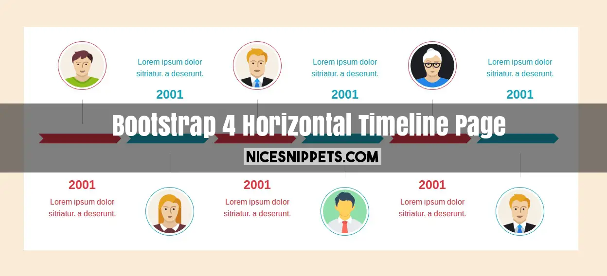
Horizontal Timeline page design using bootstrap 4
Bootstrap 4 horizontal timeline page design. this timeline page is fully responsive and support all the browser. In this timeline page design display yearly data, monthly data, weekly data and daily data. this is also usefull in event display. in this timeline design you can display image,date and description.
We allows to free snippets of responsive horizontal timeline bootstrap , you can download full code of horizontal timeline examples layout. Here in this post i will give you example of bootstrap timeline plugin snippet and you will get simple code of html, css and jquery. In horizontal timeline new design snippet i give you three tab with html, css and js, you can easily get code of horizontal timeline bootstrap layout.
<!DOCTYPE html>
<html>
<head>
<link rel="stylesheet" type="text/css" href="//maxcdn.bootstrapcdn.com/font-awesome/4.7.0/css/font-awesome.min.css">
<link rel="stylesheet" href="//maxcdn.bootstrapcdn.com/bootstrap/4.0.0-beta.2/css/bootstrap.min.css" integrity="sha384-PsH8R72JQ3SOdhVi3uxftmaW6Vc51MKb0q5P2rRUpPvrszuE4W1povHYgTpBfshb" crossorigin="anonymous">
</head>
<body>
<div class="container">
<div class="row timeline text-center">
<div class="col-lg-2 col-sm-2 col-12 timeline-section1 text-danger">
<div class="row">
<div class="col-lg-12 col-md-12 col-6 timeline-icon-section">
<img src="/demo/man01.png" class="rounded-circle img-thumbnail">
<div class="borders"></div>
</div>
<div class="col-lg-12 col-md-12 col-6 timeline-content-bottom">
<h1>2001</h1>
<p>Lorem ipsum dolor sitriatur. a deserunt.</p>
</div>
</div>
</div>
<div class="col-lg-2 col-sm-2 col-12 timeline-section2 text-info">
<div class="row">
<div class="col-lg-12 col-md-12 col-6 timeline-content-top">
<p>Lorem ipsum dolor sitriatur. a deserunt.</p>
<h1>2001</h1>
</div>
<div class="col-lg-12 col-md-12 col-6 timeline-icon-section">
<div class="borders"></div>
<img src="/demo/man02.png" class="rounded-circle img-thumbnail">
</div>
</div>
</div>
<div class="col-lg-2 col-sm-2 col-12 timeline-section1 text-danger">
<div class="row">
<div class="col-lg-12 col-md-12 col-6 timeline-icon-section">
<img src="/demo/man03.png" class="rounded-circle img-thumbnail">
<div class="borders"></div>
</div>
<div class="col-lg-12 col-md-12 col-6 timeline-content-bottom">
<h1>2001</h1>
<p>Lorem ipsum dolor sitriatur. a deserunt.</p>
</div>
</div>
</div>
<div class="col-lg-2 col-sm-2 col-12 timeline-section2 text-info">
<div class="row">
<div class="col-lg-12 col-md-12 col-6 timeline-content-top">
<p>Lorem ipsum dolor sitriatur. a deserunt.</p>
<h1>2001</h1>
</div>
<div class="col-lg-12 col-md-12 col-6 timeline-icon-section">
<div class="borders"></div>
<img src="/demo/man04.png" class="rounded-circle img-thumbnail">
</div>
</div>
</div>
<div class="col-lg-2 col-sm-2 col-12 timeline-section1 text-danger">
<div class="row">
<div class="col-lg-12 col-md-12 col-6 timeline-icon-section">
<img src="/demo/man01.png" class="rounded-circle img-thumbnail">
<div class="borders"></div>
</div>
<div class="col-lg-12 col-md-12 col-6 timeline-content-bottom">
<h1>2001</h1>
<p>Lorem ipsum dolor sitriatur. a deserunt.</p>
</div>
</div>
</div>
<div class="col-lg-2 col-sm-2 col-12 timeline-section2 text-info">
<div class="row">
<div class="col-lg-12 col-md-12 col-6 timeline-content-top">
<p>Lorem ipsum dolor sitriatur. a deserunt.</p>
<h1>2001</h1>
</div>
<div class="col-lg-12 col-md-12 col-6 timeline-icon-section">
<div class="borders"></div>
<img src="/demo/man02.png" class="rounded-circle img-thumbnail">
</div>
</div>
</div>
</div>
</div>
</body>
</html>
body{
margin-top: 30px;
background-color: #FAEBD7;
}
.timeline{
background-color: #fff;
padding: 30px;
}
.timeline-section1 .timeline-icon-section,
.timeline-section2 .timeline-content-top{
position: relative;
border-bottom:20px solid #DC3545;
height:210px;
}
.timeline-section2 .timeline-content-top{
border-bottom:20px solid #17A2B8;
padding-top: 30px;
}
.timeline-section1 .timeline-icon-section:after{
content: " ";
position:absolute;
top:190px;
right: 0px;
border:10px solid #fff;
border-left-color:#DC3545;
}
.timeline-section1 .timeline-icon-section:before{
content: " ";
position:absolute;
top:190px;
left:0px;
border:10px solid transparent;
border-left-color:#fff;
}
.timeline-section2 .timeline-icon-section:after{
content: " ";
position:absolute;
top:-20px;
right: 0px;
border:10px solid #fff;
border-left-color:#17A2B8;
}
.timeline-section2 .timeline-icon-section:before{
content: " ";
position:absolute;
top:-20px;
left:0px;
border:10px solid transparent;
border-left-color:#fff;
}
.timeline-icon-section img{
border: 1px solid #DC3545;
width: 100px;
height: 100px;
}
.borders{
border-right:1px solid #c2c2c2;
height:50px;
width: 1px;
margin: 20px auto;
}
.timeline-section2 .timeline-icon-section img{
border: 1px solid #17A2B8;
}
.timeline-content-bottom{
margin-top:70px;
}
.timeline-content-bottom h1,.timeline-content-top h1{
font-size: 25px;
font-weight: bold;
}
.timeline-section2 .timeline-content-top{
height:210px;
}
@media (min-width:320px) and (max-width:640px){
.timeline-section1 .timeline-icon-section::after,
.timeline-section1 .timeline-icon-section::before,
.timeline-section2 .timeline-icon-section::before,
.timeline-section2 .timeline-icon-section::after,
.timeline-section2 .timeline-icon-section,
.timeline-section2 .timeline-content-top,
.timeline-section1 .timeline-icon-section{
border:none;
}
.timeline-section2{
border-bottom: 3px solid #2CA2B8;
margin-bottom: 15px;
}
.timeline-section1{
border-bottom: 3px solid #DC3545;
margin-bottom: 15px;
}
}