 NiceSnippets.com
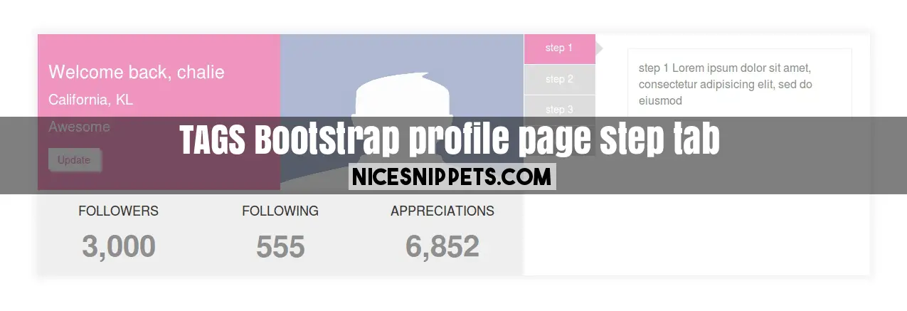
Bootstrap profile page example with step tab
Bootstrap profile page design example with custom step tab using html and css.
you can get code of bootstrap vertical tabs responsive snippet. we give you example of bootstrap profile page example with step tab , you can simple copy bellow code and use in your project. If it free snippets of bootstrap profile page example So you have to simple get those bellow code from tab of html, css and js. you simple click on HTML Code then you will get html code bootstrap profile layout snippets, click on JS Code tab get code of jquery codd for bootstrap profile page template free snippets, same as for CSS Code tab. It's pretty easy and simple example of bootstrap profile page html snippet.
<!DOCTYPE html>
<html>
<head>
<link rel="stylesheet" type="text/css" href="https://maxcdn.bootstrapcdn.com/bootstrap/3.3.7/css/bootstrap.min.css">
<link rel="stylesheet" type="text/css" href="https://maxcdn.bootstrapcdn.com/font-awesome/4.7.0/css/font-awesome.min.css">
<script src="https://ajax.googleapis.com/ajax/libs/jquery/3.2.1/jquery.min.js"></script>
<script src="https://maxcdn.bootstrapcdn.com/bootstrap/3.3.7/js/bootstrap.min.js"></script>
</head>
<body>
<div class="container section-profile">
<div class="row profile-mainSection">
<div class="col-md-7 col-sm-7 profile-section-mainPart">
<div class="row">
<div class="col-md-6 col-sm-6 profile-detail">
<h1>Welcome back, chalie</h1>
<p>California, KL</p>
<span>Awesome</span><br>
<button class="btn btn-defult updateBtn">Update</button>
</div>
<div class="col-md-6 col-sm-6 profile-img">
<img src="/demo/index.jpg">
</div>
<div class="col-md-12 col-sm-12 folloewrs">
<div class="row">
<div class="col-md-4 col-sm-4 col-xs-4">
<h1>FOLLOWERS</h1>
<p>3,000</p>
</div>
<div class="col-md-4 col-sm-4 col-xs-4">
<h1>FOLLOWING</h1>
<p>555</p>
</div>
<div class="col-md-4 col-sm-4 col-xs-4">
<h1>APPRECIATIONS</h1>
<p>6,852</p>
</div>
</div>
</div>
</div>
</div>
<div class="col-md-5 col-sm-5">
<div class="row">
<div class="col-md-12 col-sm-12 tab-bar">
<div class="tabbable tabs-left left-tab-process">
<ul class="nav nav-tabs book-process-ltab text-center">
<li class="active li"><a href="#a" data-toggle="tab">step 1</a></li>
<li class="li"><a href="#b" data-toggle="tab">step 2</a></li>
<li class="li"><a href="#c" data-toggle="tab">step 3</a></li>
<li class="li"><a href="#d" data-toggle="tab">step 4</a></li>
</ul>
<div class="tab-content">
<div class="tab-pane active" id="a">
<p> step 1
Lorem ipsum dolor sit amet, consectetur adipisicing elit, sed do eiusmod
</p>
</div>
<div class="tab-pane" id="b">
<p>step 2
Lorem ipsum dolor sit amet, consectetur adipisicing elit, sed do eiusmod
tempor incididunt ut labore et dolore magna aliqua. Ut enim ad minim veniam.
</p>
</div>
<div class="tab-pane" id="c">
<p>step 3
Lorem ipsum dolor sit amet, consectetur adipisicing elit, sed do eiusmod
tempor incididunt ut labore et dolore magna aliqua. Ut enim ad minim veniam.
</p>
</div>
<div class="tab-pane" id="d">
<p>step 4
Lorem ipsum dolor sit amet, consectetur adipisicing elit, sed do eiusmod
tempor incididunt ut labore et dolore magna aliqua. Ut enim ad minim veniam.
</p>
</div>
</div>
</div>
</div>
</div>
</div>
</div>
</div>
</body>
</html>
.profile-mainSection{
box-shadow:0px -1px 9px 5px #F1F1F1;
}
.profile-section-mainPart{
background-color:#EF94BF;
}
.profile-detail{
color:#fff;
}
.profile-detail h1{
padding: 20px 0px 0px 0px;
font-size:25px;
}
.profile-detail p,
.profile-detail span{
font-size:20px;
}
.updateBtn:hover,
.updateBtn{
background-color: #fff;
border-radius: 0px;
height:30px;
color:#EF94BF;
margin-top: 15px;
box-shadow: 3px 3px 2px 0px #fff;
}
.profile-img{
padding: 0px;
}
.profile-img img{
width: 100%;
height:219px;
}
.folloewrs{
text-align: center;
background-color: #EEEEEE;
}
.folloewrs h1{
font-size:18px;
margin-top:20px;
}
.folloewrs p{
padding: 0px;
font-size:42px;
font-weight:600;
color:#8E8E8E;
}
.tabs-left > .nav-tabs {
float: left;
margin-right: 22px;
border: none;
}
.tabs-left > .nav-tabs > li > a, .tabs-right > .nav-tabs > li > a {
min-width: 74px;
margin-right: 0;
margin-bottom: 2px;
background-color:#DDDDDD;
border-radius:0px;
color:#fff;
}
.tabs-left > .nav-tabs .active > a, .tabs-left > .nav-tabs .active > a:hover, .tabs-left > .nav-tabs .active > a:focus {
border-color: #ddd transparent #ddd #ddd;
background-color:#EF94BF;
color: #fff;
border:none;
}
.left-tab-process .tab-content{
margin-left:131px;
}
.book-process-ltab{
max-width:131px;
}
.tab-content h1{
font-size:25px;
text-align: left;
padding:30px 0px 5px 0px;
}
.tab-content p{
font-size:16px;
color:#8E8E8E;
}
.tab-pane {
padding:20px 10px 10px 0px !important;
border:none;
}
.tab-pane h1{
margin:0px;
border:1px solid #fff;
padding:15px 0px 15px 0px;
}
.tab-pane p{
border:1px solid #EEEEEE;
padding:15px;
margin: 0px;
}
.tab-content{
text-align:left;
}
.nav > li > a{
padding: 9px 24px;
}
.nav{
margin-left: -14px;
}
.tabs-left > .nav-tabs .active:after{
content: " ";
position:absolute;
left:100.3px;
top:9px;
border:11px solid transparent;
border-left-color:#DDDDDD;
}
.li a{
height:42px !important;
width:100px !important;
}
@media(min-width : 320px) and (max-width : 800px){
.folloewrs h1{
font-size: 10px;
}
.folloewrs p{
font-size: 28px;
}
.profile-detail h1{
padding-top: 0px;
}
.profile-detail{
padding-bottom: 20px;
}
}