 NiceSnippets.com
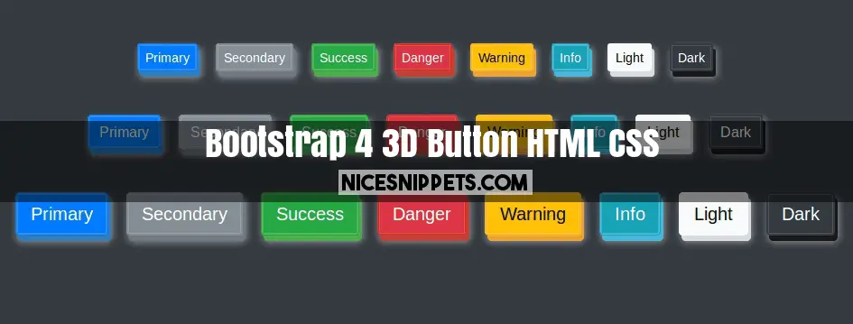
3D button example using html,css and bootstrap 4
In this demo we give you how to create 3D button using html,css and bootstrap 4. you can easily use with bootstrap 4. this is one type of shadow or embossed button. this all the button look like 3D. in this 3D button demo we use bootstrap button class.
We allows to free snippets of btn3d , you can download full code of bootstrap button shadow layout. Here in this post i will give you example of bootsnipp 3d buttons snippet and you will get simple code of html, css and jquery. In 3d buttons bootstrap snippet i give you three tab with html, css and js, you can easily get code of bootstrap embossed button layout.
<!DOCTYPE html>
<html lang="en">
<head>
<link rel="stylesheet" href="https://maxcdn.bootstrapcdn.com/bootstrap/4.0.0-beta.2/css/bootstrap.min.css" integrity="sha384-PsH8R72JQ3SOdhVi3uxftmaW6Vc51MKb0q5P2rRUpPvrszuE4W1povHYgTpBfshb" crossorigin="anonymous">
</head>
<body class="bg-dark">
<br><br><br>
<div class="container text-center btn-main">
<div class="row">
<div class="col-lg-12 col-12 col-sm-12 mb-5 btn-small">
<button type="button" class="btn btn-primary btn-sm btn3d">Primary</button>
<button type="button" class="btn btn-secondary btn-sm btn3d">Secondary</button>
<button type="button" class="btn btn-success btn-sm btn3d">Success</button>
<button type="button" class="btn btn-danger btn-sm btn3d">Danger</button>
<button type="button" class="btn btn-warning btn-sm btn3d">Warning</button>
<button type="button" class="btn btn-info btn-sm btn3d">Info</button>
<button type="button" class="btn btn-light btn-sm btn3d">Light</button>
<button type="button" class="btn btn-dark btn-sm btn3d">Dark</button>
</div>
</div>
<div class="row">
<div class="col-lg-12 col-12 col-sm-12 mb-5 btn-medium">
<button type="button" class="btn btn-primary btn-md btn3d">Primary</button>
<button type="button" class="btn btn-secondary btn-md btn3d">Secondary</button>
<button type="button" class="btn btn-success btn-md btn3d">Success</button>
<button type="button" class="btn btn-danger btn-md btn3d">Danger</button>
<button type="button" class="btn btn-warning btn-md btn3d">Warning</button>
<button type="button" class="btn btn-info btn-md btn3d">Info</button>
<button type="button" class="btn btn-light btn-md btn3d">Light</button>
<button type="button" class="btn btn-dark btn-md btn3d">Dark</button>
</div>
</div>
<div class="row">
<div class="col-lg-12 col-12 col-sm-12 mb-5 btn-large">
<button type="button" class="btn btn-primary btn-lg btn3d">Primary</button>
<button type="button" class="btn btn-secondary btn-lg btn3d">Secondary</button>
<button type="button" class="btn btn-success btn-lg btn3d">Success</button>
<button type="button" class="btn btn-danger btn-lg btn3d">Danger</button>
<button type="button" class="btn btn-warning btn-lg btn3d">Warning</button>
<button type="button" class="btn btn-info btn-lg btn3d">Info</button>
<button type="button" class="btn btn-light btn-lg btn3d">Light</button>
<button type="button" class="btn btn-dark btn-lg btn3d">Dark</button>
</div>
</div>
</div>
</body>
</html>
.btn-main .btn3d:hover {
-moz-box-shadow: inset 0 0 10px #fff;
-webkit-box-shadow: inset 0 0 10px#fff;
box-shadow: inset 0 0 10px rgba(0,0,0,0.5);
transition: .3s all;
cursor: pointer;
}
.btn-primary {
box-shadow:0 0 0 1px #428bca inset, 0 0 0 2px rgba(255,255,255,0.15) inset, 3px 6px 0 0 #357ebd, 3px 6px 8px 1px rgba(255,255,255,0.5);
}
.btn-secondary {
box-shadow:0 0 0 1px #868E96 inset, 0 0 0 2px rgba(255,255,255,0.15) inset, 3px 6px 0 0 #727980, 3px 6px 8px 1px rgba(255,255,255,0.5);
}
.btn-success {
box-shadow:0 0 0 1px #5cb85c inset, 0 0 0 2px rgba(255,255,255,0.15) inset, 3px 6px 0 0 #4cae4c, 3px 6px 8px 1px rgba(255,255,255,0.5);
}
.btn-info {
box-shadow:0 0 0 1px #5bc0de inset, 0 0 0 2px rgba(255,255,255,0.15) inset, 3px 6px 0 0 #46b8da, 3px 6px 8px 1px rgba(255,255,255,0.5);
}
.btn-warning {
box-shadow:0 0 0 1px #f0ad4e inset, 0 0 0 2px rgba(255,255,255,0.15) inset, 3px 6px 0 0 #eea236, 3px 6px 8px 1px rgba(255,255,255,0.5);
}
.btn-danger {
box-shadow:0 0 0 1px #c63702 inset, 0 0 0 2px rgba(255,255,255,0.15) inset, 3px 6px 0 0 #C24032, 3px 6px 8px 1px rgba(255,255,255,0.5);
}
.btn-light {
box-shadow:0 0 0 1px #F8F9FA inset, 0 0 0 2px rgba(255,255,255,0.15) inset, 3px 6px 0 0 #D9DDE1, 3px 6px 8px 1px rgba(255,255,255,0.5);
}
.btn-dark {
box-shadow:0 0 0 1px #343A40 inset, 0 0 0 2px rgba(255,255,255,0.15) inset, 3px 6px 0 0 #19191a, 3px 6px 8px 1px rgba(255,255,255,0.5);
}